Prudential | Critical Mass
UI Design | Responsive Design | Branding | Rapid prototyping
Tools: Adobe Illustrator | Sketch | Invision
Context and goal
The Critical Mass design team undertook a year-long project to enhance the customer experience (CX). User research pinpointed areas for improvement, leading to the formation of a dedicated CX team alongside client stakeholders. This collaborative group addressed technological challenges while prioritizing CX governance, employee engagement, and a clear articulation of brand values and purpose. This comprehensive approach transformed Critical Mass into a more customer-centric organisation.
Role and Responsibilities
Working in a team of UI designers I contributed to elements of the UI designed for the online portal's look and feel, making it easy and enjoyable to use. This included creating consistent design elements and a clear visual style guide.
Customer Focus at the Core: The company puts customers first, keeping promises and using data to deliver what users need. Engaged employees are key to this focus.
Seamless Customer Experience: Everyone in the company works together to ensure a smooth and unified experience for all customers.
Strong Relationships Built: The CX team, led by Critical Mass, delivered on promises and built trust with customers, staff, and partners.
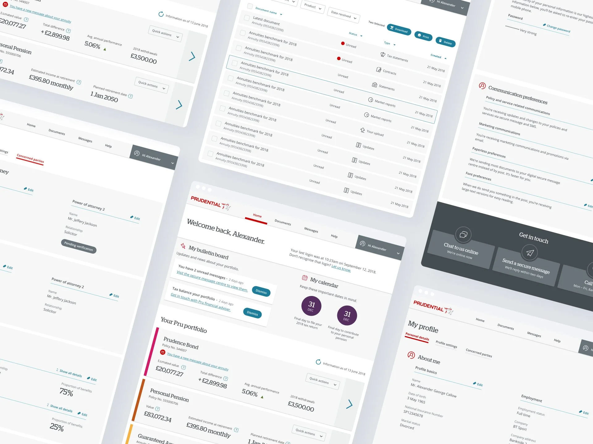
Development of the UI
The online portal's user interface (UI) design aimed to be both aesthetically pleasing and incredibly easy to navigate. We achieved this by drawing inspiration from industry leaders. Through competitor analysis, we identified best practices in color schemes, layouts, and user flows. This analysis informed the creation of our design libraries, patterns, and a comprehensive style guide. These elements ensured a consistent look and feel throughout the entire portal, seamlessly integrating the user's expectations with the brand's unique visual identity. Ultimately, this approach transformed the brand's vision into a tangible, engaging reality for users to explore and enjoy.

MyPru | Pensions

MyPru | Documents
The design of the MyPru dashboard for storing documents combines functionality and user-friendly aesthetics, offering a seamless experience for managing important files.

MyPru | Onboarding design
The onboarding process has been carefully designed from both a UI and UX standpoint to be succinct, straightforward, and efficient, featuring the newly applied icons. With a concise 4-step structure, users have the flexibility to skip any step if they prefer.


Ideation process for the data visualisation concepts
Through these examples, my aim was to leverage data visualisation and craft effective colour schemes to enhance user understanding and engagement. Here are a few examples of my contributions:
Bond Breakdown:
This infographic uses charts, graphs, and colour-coded segments to break down the complex composition of bonds into an easy-to-understand format. The colour scheme guides users through the different elements with clarity.

Visualising Finance: Charts that Inform
I tackled two financial concepts:
Interest Rates: A comparative chart with a gradient colour scheme presented different rates at a glance, allowing users to make informed decisions based on colour intensity.
Bond Composition: An infographic with charts, graphs, and a meticulous colour-coding system transformed complex bond data into an engaging and easy-to-understand format.

Simplifying Finance Through Design
I used visuals to bring clarity to complex financial concepts:
Bond Infographic: Charts, graphs, and colour-coding transformed bond composition data into an understandable format.
Interest Rate Chart: A gradient colour scheme intuitively conveys different rates for easy decision-making.
Maturity Timeline: A colour-coordinated timeline visualises the progression of maturity dates across various bonds.
These engaging visuals empowered users to grasp financial concepts with greater ease.
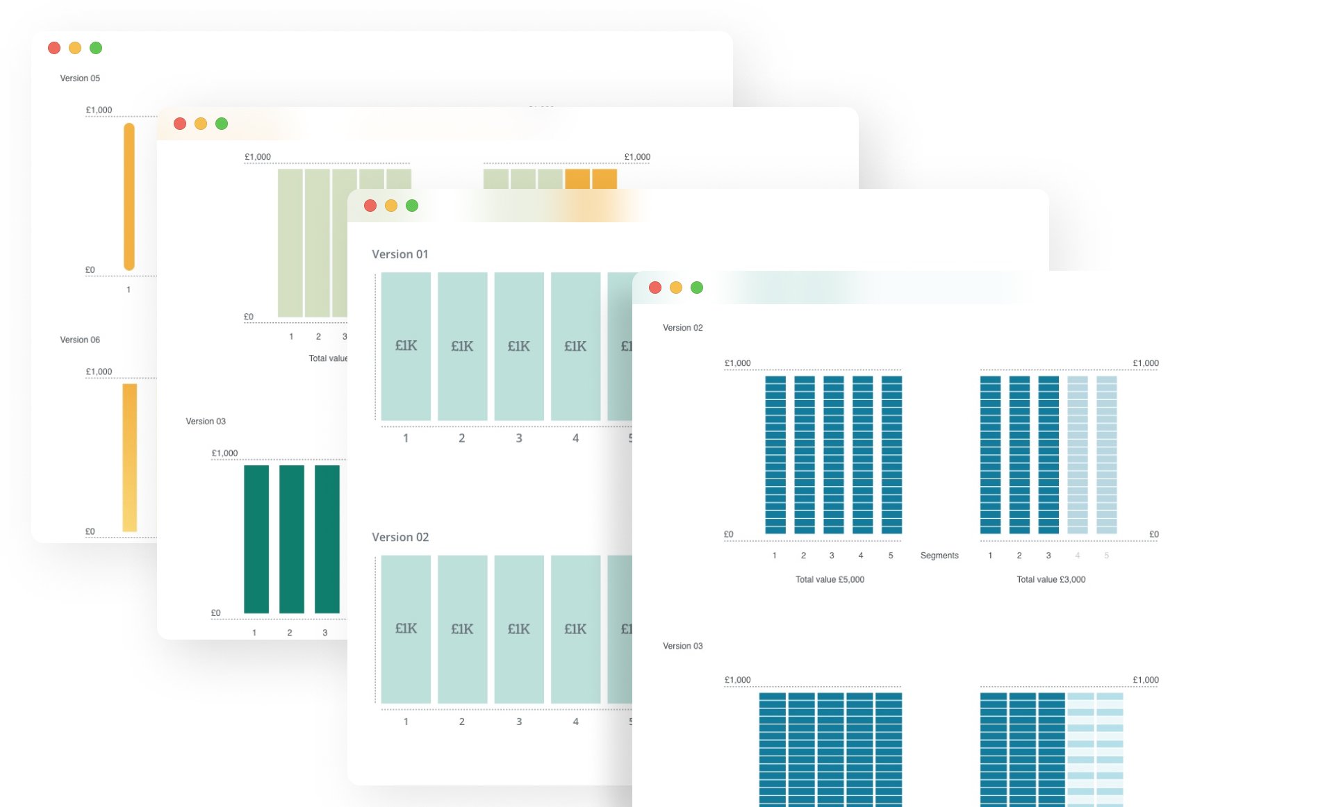
Financial Concepts Made Visual
I used clear visuals to explain complex financial ideas:
Bonds: An infographic with charts, colour-coding, and graphs simplified bond composition.
Interest Rates: A gradient colour chart displayed different rates for easy comparison.
Maturity Dates: A colour-coordinated timeline visualises maturity progression across bonds.
Risk vs. Return: A dynamic colour scheme in a risk-return matrix helped users understand risk/reward trade-offs.
These visuals empowered users to grasp financial concepts with greater ease.

For more information on the ux and research of the project.