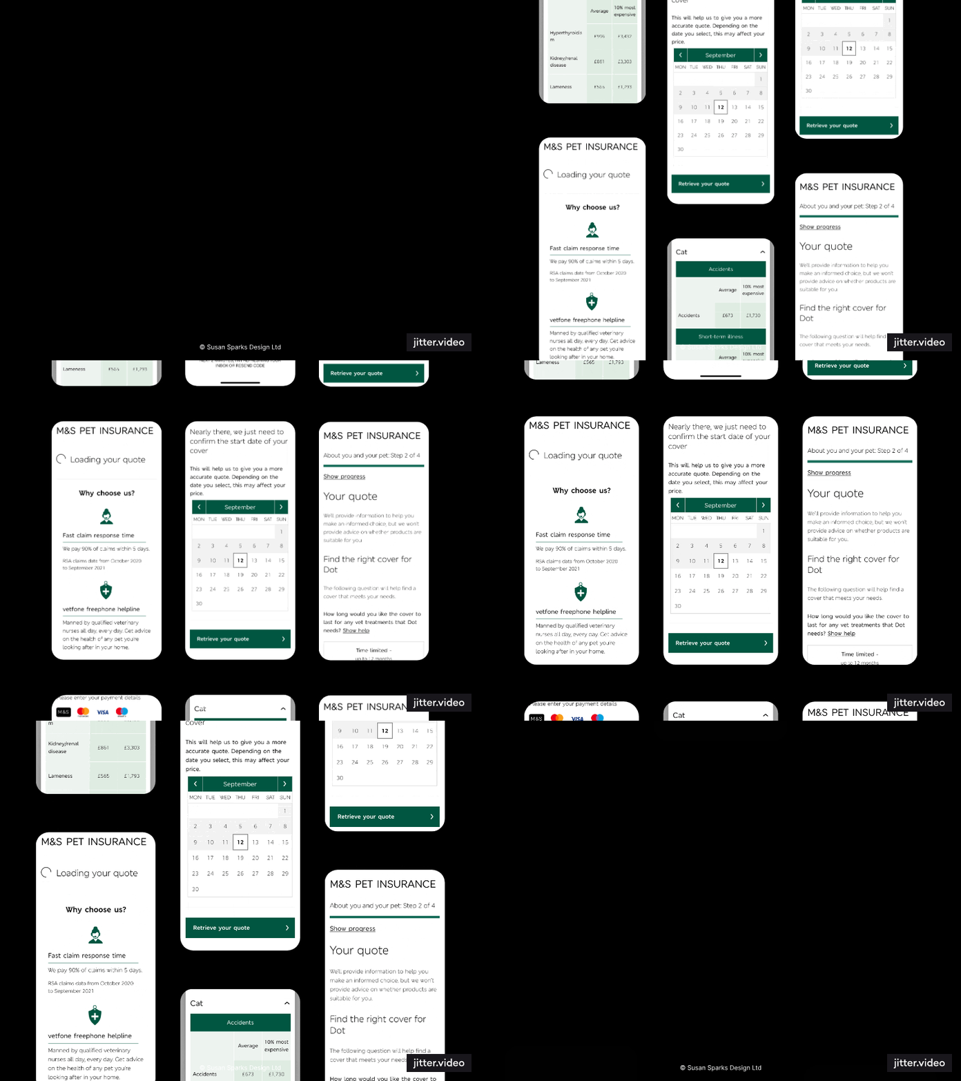
M&S Bank | RSA Insurance Group
Desktop view of user journey UI
UI Design | Responsive Design | Branding | Prototyping
Tools: Figma
Navigating a Brand Refresh: MY ROLE AS UI DESIGNER
The project presented a unique challenge: integrating elements of a forthcoming client rebrand within the constraints of their existing design system. To achieve this, I played a pivotal role in establishing a harmonious middle ground that respected both the client's future vision and the project's immediate objectives.
Balancing brand evolution with project needs, involved meticulously integrating the nascent brand guidelines into our existing design libraries. The outcome was a set of design resources that showcased a cohesive blend of new and existing elements. As a result, the rebrand's essence was subtly woven into the project while maintaining its established functionality and aesthetic.
Old brand and product
MAIN DESIGN LEARNINGS
The Discover and Define stages of the project highlighted an opportunity to enhance our design system. We strategically repurposed existing core elements while also incorporating user-tested components designed for future adaptability. This foresight ensured the system's ongoing usability and empowered the team to adapt to evolving design needs.
Overall, this project exemplifies the importance of striking a balance between present goals and future aspirations. By embracing a collaborative and forward-thinking approach, we were able to successfully navigate a complex branding scenario while laying the groundwork for a more future-proof design system.
Design systemS
New component design
Two goals had presented themselves: creating user-friendly components and integrating it smoothly into the RSA design system (used for products like Home, Motor, and Claims) without delaying development.
-
Clear communication was crucial. I ensured I met deadlines while designing the component with an eye towards future ease of use.
Deliverables needed approval from both internal and external stakeholders, and the final functionality was documented in a technical specification for the Business Analyst.
-
My expertise in design systems and adapting working processes to the project's needs ensured the mid-brand release met all requirements.
-
Ultimately, the result was a solution that aligned perfectly with M&S's future brand vision and improved the user experience across various RSA products.
This project served as a test case for the newly formed Design System team at RSA, which included UI/UX/Content designers, an external developer manager, the Head of Design, and a project manager.
problems that I over came
The project hit a hurdle when product specifications changed mid-stream due to input from other departments. As the UI designer, drawing on my problem-solving skills, I anticipated potential roadblocks using the double-diamond design approach, a user-centered process for tackling design challenges. However, in this case, the traditional approach wouldn't work. We couldn't afford for the UI work to stall while the UX and content designer fully explored solutions back through the Discover and Define phases. We needed a quick and efficient response.
-
During our daily standup meeting, I proposed a solution: the UI team would tackle quick-turnaround elements requiring minimal UX input. This kept the developers busy while the UX and content designer focused on the new product specifications. The flexibility of our roles allowed us to adapt our workflow and communicate effectively as a mini-team. Our focus remained on creating a user-friendly and engaging experience, all while meeting deadlines.
-
The UX/content designer and I ensured success through:
Maintaining clear communication with stakeholders.
Implementing regular internal and client sign-off points.
Delivering a steady stream of work to developers.
-
Our efforts minimised the project's impact on time, budget, and team morale. This project became a valuable case study for RSA's design and product teams. We shared the lessons learned and potential delivery risks, ultimately leading to the creation of a contingency plan for future projects.
-
Adding another layer of complexity, our design team was transitioning from Sketch to Figma during this project. This meant transferring and quality-controlling all design libraries. I anticipated this challenge and volunteered to spearhead the migration before the project began. This gave me the opportunity to learn Figma's in-depth features like variables and autolayout etc. My learnings were then shared with the wider design team, benefiting other teams transitioning to the new software.
FINAL DESIGNS
Mobile view of user journey UI
For more information on the ux|research and project outcomes.
